
An empirical relation among actual ET, PET and P.
Evapotranspiration in irrigated areas is an important dynamic in the for the water balance in many parts of the world. However, data on the amount of irrigated water that is used by crops is not know. In this exercise we present a simple method to estimate the amount of irrigated water.
We use the Budyko curve to estimate the amount of irrigated water. The Budyko curve is often used to estimate the actual evaporation as a function of the aridity index in a catchment.

The Budyko curve shows the empirical relation among actual evapotranspiration, potential evapotranspiration (PET) and precipitation (P). Simple physical contraints on energy and water determine an energy limit (PET is smaller than P) and a water limit, where P > PET. We use the Budyko curve to calculate the actual ET and compare this with the remote sensing derived aET.
Step 1: Import the “Reprocessed GLDAS-2: Global Land Data Assimilation System” and chirps dataseries.
Step 2: Import a dataseries with actual ET.
// import actual ET data
var aET = ee.ImageCollection("users/atepoortinga/etdata");
Step 3: Import a polygon with the area of interest.
// polygon for the Ca basin
var Ca = ee.FeatureCollection('ft:11uQewh4u7NFXneH99YPs6P9F1Au6wxBq959BZWt_','geometry');
Step 4: Define the start and end of the dataseries.
// define start and end date
var startdate = ee.Date.fromYMD(2003,1,1);
var enddate = ee.Date.fromYMD(2003,12,31);
Step 5: Filter based on date and location.
// select precipitation for time range
var P = chirps.filterDate(startdate, enddate)
  .sort('system:time_start', false)
  .filterBounds(Ca);

// select et for time range
var aet = aET.filterDate(startdate, enddate)
   .sort('system:time_start', false)
   .filterBounds(Ca);

// select PET for time range
var PET = gldas2.filterDate(startdate, enddate)
  .sort('system:time_start', false)
  .select("PotEvap_tavg")
  .filterBounds(Ca);
Step 6: Calculate the yearly values.
// Calculate yearly values
var yearly_P = P.sum();
var yearly_aET = aet.sum();
var yearly_PET = PET.mean().multiply(31536000).divide(1000).divide(2256);
(optional) Step 7: Display the layers
// set vizualization parameters
var viz_p = {min:1000.0, max:2000, palette:"56ff00,00ecff,240098,d001ea"};
var viz_et = {min:500.0, max:2500, palette:"0011ff,f0ff00,ff0000"};

// add layers to map
Map.addLayer(yearly_P.clip(Ca),viz_p,"yearly P");
Map.addLayer(yearly_aET.clip(Ca),viz_et,"yearly aet");
Map.addLayer(yearly_PET.clip(Ca),viz_et,"yearly PET");

// set center
Map.centerObject(Ca,8);
Step 7: Calculate PET/P and AET/P.
// calculate pet/p
var pet_p = yearly_PET.divide(yearly_P);
// calculate et/p
var aet_p = yearly_aET.divide(yearly_P);
Step 8: update the masks to make sure we are comparing the same areas.
// updatemasks to make sure we are comparing the same areas
aet_p = aet_p.updateMask(pet_p);
pet_p = pet_p.updateMask(aet_p);
(optional) Step 9: Display the results.
// set viz parameters
var viz_budyko = {min:0.0, max:2, palette:"56ff00,00ecff,240098,d001ea"};

// add layers to map
Map.addLayer(pet_p.clip(Ca),viz_budyko,"PET / P");
Map.addLayer(aet_p.clip(Ca),viz_budyko,"aET / P");
Step 10: Get the values of the layers
// Get the x and y-values
var xValues = pet_p.toArray().reduceRegion(ee.Reducer.toList(),Ca, 2500).get('array');
var yValues = aet_p.toArray().reduceRegion(ee.Reducer.toList(),Ca, 2500).get('array');

print(xValues);
print(yValues);
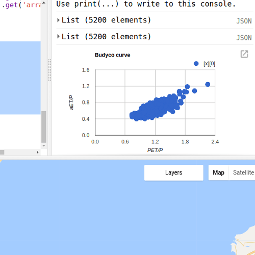
Step 11: Display the results.
//  Create the chart
var mychart = ui.Chart.array.values(yValues,0, xValues)
    .setChartType('LineChart')
    .setOptions({
      title: 'Budyco curve',
      vAxis: {'title': 'aET/P'},
      hAxis: {'title': 'PET/P'}
});

// print the result
print(mychart);
See an example here.
Step 11: Download the Graph as csv file.
Step 12: plot the graph in Excel.
Step 13:Use the script below to get the PET and aET data.
// Get PET and aET data
var aET_mean = aET.mean();
var PET_mean = PET.mean();

// updatemasks to make sure we are comparing the same areas
aET_mean = aET_mean.updateMask(PET_mean);
PET_mean = PET_mean.updateMask(aET_mean);

// graph PET and aET
var xPET = aET_mean.toArray().reduceRegion(ee.Reducer.toList(),Ca, 2500).get('array');
var yaET = PET_mean.toArray().reduceRegion(ee.Reducer.toList(),Ca, 2500).get('array');

//  Create the chart
var mychart = ui.Chart.array.values(xPET,0, yaET)
    .setChartType('LineChart')
    .setOptions({
      title: 'PET versus aET',
      vAxis: {'title': 'aET'},
      hAxis: {'title': 'PET'}
});
print(mychart);
See and example here.
Step 14: Download the csv data for PET and aET.
Step 15: Add a column to the worksheet and calculate the function below. φ = Ep / P.


Hi team, thanks for this nice forum.
I would like to request if you have python code to draw a budyko curve. Please, I will appreciate so much, you can reach me through christossy87@yahoo.com
LikeLike